The Neo-Futurists
Groundplan website, Interactive front end, Audience Journey, Education Add-On
The Neo-Futurists develop experimental theater that is immediate, honest, provocative, and unlike anything else. As they approached their 30-year anniversary, the Neo-Futurists needed an update to their site to reflect their newly designed brand identity. We were honored to design and build their last site in 2014, and we were equally delighted that the Neos returned to us to refresh their site again. In addition to reflecting their updated brand, they wanted the site to serve the varied needs of their many audience segments, from tourists to artists to educators.
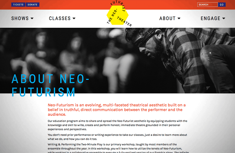
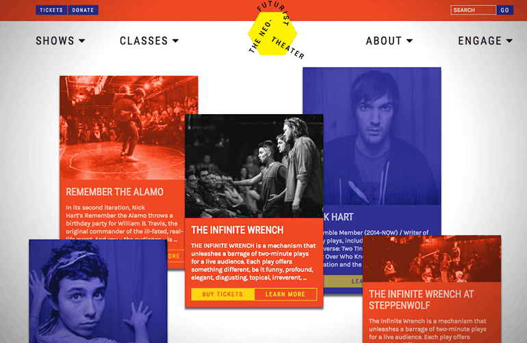
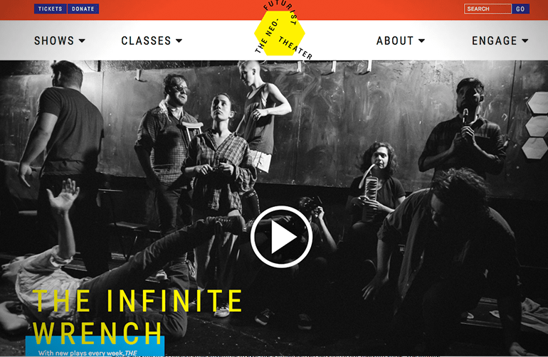
A robust audience analysis process identified key market segments and typical areas of audience motivation. Whether an audience member is looking for an unconventional night out, training in Neo-Futurism, or to learn more about the Neos’ work, all user experiences are now driven by the Neos’ values of playfulness, transparency, and collaboration. Building off their Dada- and Surrealist-inspired brand and logo, the design balances playful colors, offset text, and the Neos’ trademark black-and-white photography. Groundplan’s new education features integrate upcoming workshops into the calendar alongside events. Inspired by their flagship production The Infinite Wrench, users “throw a wrench” into home page cards – a playful way to browse the upcoming classes, plays, events, or blog articles that most interest the user.


